Mar
27

Posted by Ann Glusker on March 27th, 2018
Posted in: Data Science
Tags: data, GIS data, historical data, John Graunt, NLM Historical Division, Pew Research Center
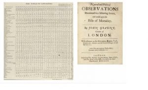
It’s so easy to think of data as a modern phenomenon, that we forget that data analysis and data visualization are phenomena which go way back. A marvelous example is John Graunt’s Bills of Mortality, which this post by John Appleby calls “a 17th century spreadsheet of deaths in London”. Appleby goes on to do some ultra-modern visualizations of the data, which illuminate connections that Graunt probably didn’t make at the time scientifically, but may have understood intuitively.
If you find this concept intriguing, either to read about or to explore more directly, consider taking a mosey through the series from the National Library of Medicine’s Historical Division, “Revealing Data: Explorations of Data in Collections”. They are making historical research data available now, across many health-related fields, and in fascinating ways! They have data in a wide range of formats, informally and formally collected, quantitative and qualitative. And among their treasures is—you guessed it—a copy of Graunt’s magnum opus, and a post about it!
Also, if data analysis is your thing, there are many sources of data sets out there, particularly from the federal government. Check out descriptions of what’s in the National Archives, or historical patent data, or that classic, historical census data, and others at Data.gov. Additionally, you might want to explore data from other sources, such as from the Pew Research Center (it doesn’t go back to the 1600s, but it’s something!), and historical GIS data from the American Association of Geographers.
Enjoy your explorations into the past—which may end up transforming our future!
