DataFlash: How DO You Tell a Story With Data Anyway?
Posted by Ann Glusker on February 13th, 2018
Posted in: Data Science
Tags: data storytelling, Data_Science, Love Data Week
As you may know, it’s “Love Data Week”! Formerly “Love Your Data Week”, this is the third year of this international data extravaganza, which seeks to “raise awareness and build a community to engage on topics related to research data management, sharing, preservation, reuse, and library-based research data services.” The theme this year is “Data Stories”, which leads to the important question, “How DO you tell a story with data anyway?”
There are many sites that will help you get started on this quest; here, here and here are some good ones. But, the main prerequisite is to KNOW YOUR DATA. You can’t tell a great story about someone else’s vacation, right? Similarly, to tell a good story with your data, you need to know where it comes from and how it was gathered, what question it’s meant to answer, and how it may lead you astray (if your random sample only comes from people with landlines, you may have a LEETLE bias).
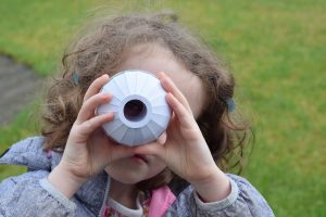
Once you know your data, LOOK FOR CONNECTIONS (like the girl in the picture!). Does a certain pattern seem to emerge if you look at two variables in conjunction with each other? Does one item seem to predict another? How does the data compare with other reports you can find in journals or online or among reports from colleagues? Remember, the data don’t necessarily need to be quantitative; qualitative and other types of data can tell stories too!
Then, once the connections start to emerge, SHARE YOUR LOVE! There are so many great tools to help you make the story take a shape that allows others to read/absorb it! For example, Tableau has a public version that is free, Excel actually has quite a bit of capability for even sophisticated visualization, and some free online infographic platforms such as Piktochart can be very user friendly.
Be sure to check out the “Love Data Week” site, and some of the links below as well. And let us know if you have ideas for how we can help you tell better stories!
–“Best Starts for Kids” Data Storytelling webinar
–Data Storytelling Resources, Part 1 and Part 2
–NIH LibGuide on Scientific Communication and Data Storytelling (with slides and handout!)
—Storytelling with Data and related resource list
 ABOUT Ann Glusker
Email author
View all posts by Ann Glusker
ABOUT Ann Glusker
Email author
View all posts by Ann Glusker
 Visit us on Facebook