Oct
07

Posted by nnlmneo on October 7th, 2016
Posted in: Data Visualization
Some of you may be working on conference posters and paper presentations for Fall conferences. And some of those will probably include charts to demonstrate data representing a lot of hard work on your part. In most cases you have minutes to use that chart to get your audience to understand the data.
Stephanie Evergreen has great advice for displaying chart data. She literally wrote the books on it: Presenting Data Effectively and Effective Data Visualization. Her recent blog post is about one of the simplest and most powerful changes you can make to effectively present your chart data: “Strong Titles Are The Biggest Bang for Your Buck.”
What many of us do is present the data with a generic title, like “Attendance rates.” Then the viewer has to spend time working through the data and you hope that they see what you wanted them to. What Stephanie Evergreen proposes (backed by persuasive research) is to give your charts a clear title that explains what the data shows. Your poster or paper is almost certainly making a point. Determine how your chart supports the point of your presentation and state that in the title. Here are some reasons why:
Stephanie Evergreen’s post has some great examples of how a good title can really improve the impact of the chart. In addition, here is an example from the NEO webinar Make Your Point: Good Design for Data Visualization.
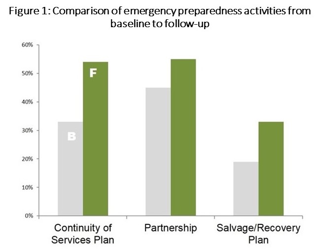
Looking at this original chart, you might notice that in each activity the follow-up showed an increase over the baseline. If you, the viewer, didn’t have a lot of time, that might be all you noticed.

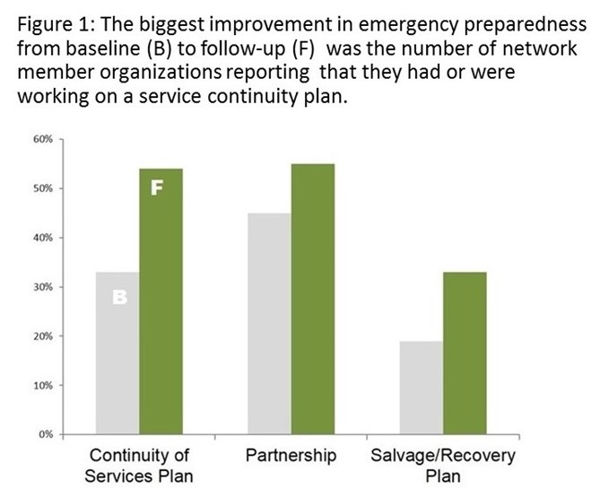
With a simple change of title , you can see that the author of this presentation is highlighting the increased number of continuity of services plans. This is designed to enhance the point of the presentation, and not waste the viewers’ time. Also, note that the title is left justified instead of centered. Because the title is a full sentence, a left-justified format is easier to read.

So, while Shakespeare might have been correct when he wrote “What’s in a name? that which we call a rose / By any other name would smell as sweet,” what if the presenter was trying to show the fortitude of Texas antique roses to survive in harsh weather conditions, and the viewer only noticed how sweet the rose smelled? Maybe the heading “A Rose” sometimes isn’t enough information.