May
30

Posted by kherzog on May 30th, 2024
Posted in: Blog
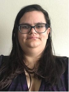
 2024 DVC Winner Profile: Cat Ellis (CE), San Diego State University
Complex Visualization (Bright Futures)
“Autism Infographic”
NEC: Cat, congratulations on your winning submission! We are so happy you decided to participate in the 2024 NNLM Data Visualization Challenge and will now love to get to know you better. Please tell us a little about yourself and about your background in data visualization.
CE: I’m a health sciences librarian at San Diego State University, where I primarily work with students, faculty, and staff in our Schools of Nursing and Speech, Language, and Hearing Sciences. The rest of my work is largely dedicated to health and data literacy, disability studies, accessibility, and neurodiversity.
I first became interested in data visualization when I was part of the Medical Library Association’s Research Training Institute in 2021. I found that data could be displayed in more dynamic and creative ways than the typical Excel charts. However, due to needing to finish graduate school and finding a full-time job as a librarian, it took me two more years to finally try doing data visualizations.
Visualizing data can make it more accessible, especially to a general audience. Data visualizations can turn complex data into something that non-experts can easily understand in a few minutes.
NEC: Now, walk us through the creative process behind your winning visualization. What were the key steps and decisions that led to its development? Why did you choose to display the data as you did?
CE: As a librarian and autism researcher, it was an obvious choice for me to visualize autism data. I wanted to use the Python skills that I had learned in the months before the challenge was announced. Additionally, I chose to use Voyant to create a word cloud based on some of the data that I had collected for a different research project.
I chose to do an infographic because I wanted to display multiple kinds of visualizations based on multiple datasets. I used a rainbow color scheme because it is the color used for autistic self-advocacy and pride.
NEC: Finally, what advice or words of encouragement would you give to data visualization practitioners who aim to participate and succeed in contests or challenges like ours?
CE: I heavily encourage newcomers to the field of data visualization to participate in contests like the NNLM Data Visualization Challenge. It allowed me to try out new ways of visualizing information and using tools like Python and Voyant.
NEC: Cat, it was lovely to learn more about you. Once again, thank you for participating in the 2024 NNLM Data Visualization Challenge and we look forward to hearing from you and your data visualization projects in the years to come! Take care!