What chart should I use?
Posted by nnlmneo on April 1st, 2016
Posted in: Data Visualization
It’s time to put your carefully collected data into a chart, but which chart should you use? And then how do you set it up from scratch in your Excel spreadsheet or Power Point presentation if you aren’t experienced with charts?
Here’s one way to start: go to the Chart Chooser at Juice Analytics. They allow you to pick your chart and then download it into Excel or Power Point. Then you can simply put in your own data and modify the chart the way you want to.
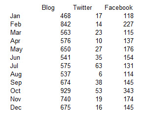
They also have a way to narrow down the options. As a hypothetical example, let’s say a fictional health science librarian, Susan, is in charge of the social media campaign for her library. She wants to compare user engagement for her Twitter, Facebook and Blog posts to see if there is any patterns in their trends. Here are some fictional stats showing how difficult it is to find trends in the data.
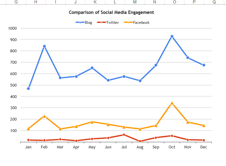
Susan goes to the Juice Analytics Chart Chooser and selects from the options given (Comparison, Distribution, Composition, Trend, Relationship, and Table). She selects Comparison and Trend, and then also selects Excel, because she is comfortable working in Excel. The Chart Chooser selects two options: a column chart and a line chart. Susan thinks the line chart would work best for her, so she downloads it (by the way, you can download both and see which one you like better). After substituting their data with hers, and making a couple of other small design changes, here is Susan’s resulting chart in Excel, showing that user engagement with both blog posts and Facebook posts shows a pattern of increasing and decreasing at the same time, but that Twitter engagement does not show the same pattern.
By the way, the total time spent selecting the chart, downloading it, putting in the fictional data, and making chart adjustments was less than 15 minutes. Is it a perfect chart? Given more time, I would suggest adjusting some more of the chart features (see our January 29, 2016 post The Zen Trend in Data Visualization). But it was a very easy way to pick out a chart that allowed Susan to learn what she needed to from the data.
One thing I want to point out is that this is not a complete list of charts. This is a good starting place, and depending on your needs, this might be enough. But if you get more involved in data, you might want to take a look at small multiples, lollipop charts, dot plots, and other ways to visualize data. Check out Stephanie Evergreen’s EvergreenData Blog for more chart types.
 ABOUT nnlmneo
Email author
View all posts by nnlmneo
ABOUT nnlmneo
Email author
View all posts by nnlmneo
 Visit us on Facebook