My Report Writing Toolkit
Posted by nnlmneo on September 9th, 2016
Posted in: Blog

I once heard evaluator extraordinaire Michael Patton say that an evaluator could staple an executive summary to a bunch of pages ripped from a phone book and no one would notice. Possibly our readers have developed a fear of drowning in numbers and technical information?
(For our younger blog followers, a phone book is that thick paperback that materializes on your doorstep about once a year and you trip over it a few times before throwing it in your recycling bin.)
Many of us are trying to write better reports, thanks to proactive efforts in our professional associations. Many such organizations provide excellent training on report writing, often to sold-out audiences. The first step toward better reporting is better synthesis of our evaluation findings. You yourself must understand your data well before you can effectively share findings with others. However, there are many other design elements in a report that you can use to help your readers understand key points and retain important information. Nonverbal elements such as color, font choice, page layout, and graphic design, all contribute to effective evaluation reporting.
I have picked up a few tricks of the trade over the past few years. So in today’s blog, I’m giving you my personal report-writing toolkit.
PowerPoint: You may think of PowerPoint as a presentation tool, but I have discovered it is also a great tool for producing written reports. Slide layouts provide flexibility in organizing graphics and text on a page. The text boxes also force me to be succinct with written content. My favorite resource for PowerPoint reports is Nancy Duarte’s Slidedocs. You can download free PowerPoint templates at her website, but truthfully, I seldom use them. They never seem quite right for what I want to present and I don’t think all of them are accessible (508 compliant). However, I use them to guide my design. The templates provide examples of good layout and color palettes. Also, Duarte’s templates exemplify effective practices for readability, such as ideal column width and line spacing.
“Presenting Data Effectively” by Stephanie Evergreen. I routinely consult this primer on presenting data when I write evaluation reports. Her book gets into the nitty-gritty of reporting evaluation results. How do you choose font type? Where do you place data labels in a chart? How do you layout a page to incorporate text and charts. She leaves no stone unturned in this book.
Free photos: Photos have their place in both written reports and presentation slides, particularly when they serve as visual metaphors for key findings. Google’s advance search has a “usage rights” option that allows you to quickly find images online that are free to use or share. However, the quality of images from Google searches is variable. I prefer to start with Pixabay, which provides consistently high quality pictures that are free to use.
Color Picker Tools: Accent colors add visual interest to reports and direct readers’ attention to key findings. There are two color picker tools that I use routinely to find accent colors for my headers and graphics. PowerPoint now has an “eye dropper” feature that allows you to add custom colors that match images in your reports.. This is the fastest way to add a custom color to your theme palette.
However, when I have time to perfect my color choices, I rely on Adobe Color. You upload your image and Adobe Color shows you a palette of complementary colors to choose from. (I like to use my report cover photo or a screen snip of a logo or web page as my image.) Adobe Color will allow you to adjust your palette to find, for example, brighter or more muted versions of your colors. Once you have the colors you want, you can get the RGV codes to create a custom color scheme for your report.
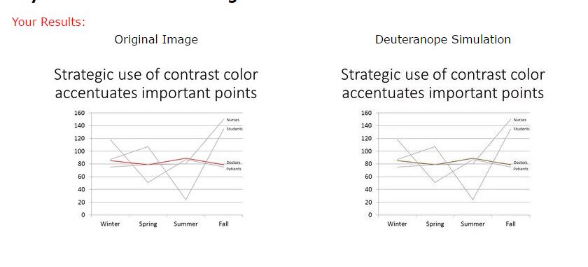
Color blindness checker: This exciting new multi-colored reporting world has its downside. A small percentage of people are colorblind, so improper color choices may make your reports less understandable to them. (The American Academy of Ophthalmologists estimates that colorblindness affects 8% of men and .5% of women.) So it’s a good idea to check your images through an app like Vischeck.
The two charts on the left show the results of a Vischeck on a line graph I designed, where I made one line red to draw attention to results for one group. If you are not color blind, you will see that the left-hand chart has a red line to highlight a specific finding. The right chart shows what colorblind readers see: the line is darker, but it is not red. The darkness of the line does provide some contrast, so it is probably acceptable. But a different color or possibly a wider line would make that finding noticeable for all readers.
Printer: If your report is going to be printed and reproduced, chances are the copies will not be in color. I have learned the hard way to print my reports in black-in-white before distributing them to be sure the contrasts are still visible without color. If not, you can try varying intensity (gray versus black) or patterns (solid versus dotted lines).
There you have it: my go-to tools for creating evaluation reports. If you have others, I hope you’ll visit the NEO’s Facebook page and share them!
Here’s the full test for Stephanie Evergreen’s book: Evergreen, SDH. Presenting data effectively. Los Angeles, CA: Sage, 2014.
Save
 ABOUT nnlmneo
Email author
View all posts by nnlmneo
ABOUT nnlmneo
Email author
View all posts by nnlmneo
 Visit us on Facebook