Uninspired by Bars? Try Dot Plots
Posted by nnlmneo on March 17th, 2017
Posted in: Data Visualization
Thanks to Jessi Van Der Volgen and Molly Knapp at the NNLM Training Office for allowing us to feature their assessment project and for providing the images in this post.
Are you tired of bars?
I don’t mean the kind of bars where you celebrate and socialize. I mean the kind used in 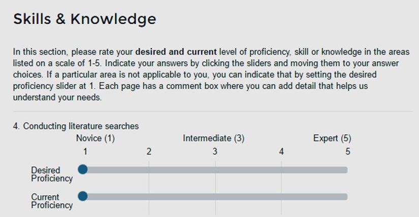 data visualization. My evidence-free theory is that people still succumb to using the justifiably maligned pie chart simply because we cannot face one more bar graph.
Take heart, readers. Today, I’m here to tell you a story about some magic data that fell on the NEO’s doorstep and broke us free of our bar chart rut.
It all began with a project by our NNLM Training Office (NTO) colleagues, the intrepid leaders of NNLM’s instructional design and delivery. They do it all. They teach. They administratively support the regions’ training efforts. They initiate opportunities and resources to up-level instructional effectiveness throughout the network. One of their recent initiatives was a national needs assessment of NNLM training participants. That was the source of the fabulous data I write about today.
For context, I should mention that training is one of NNLM’s key strategies for reaching the furthest corners of our country to raise awareness, accessibility and use of NLM health information resources. NNLM offers classes to all types of direct users, (e.g., health professionals; community-based organization staffs) but we value the efficiency of our “train-the-trainer” programs. In these classes, librarians and others learn how to use NLM resources so they, in turn, can teach their users. The national needs assessment was geared primarily toward understanding how to best serve “train-the-trainer” participants, who often takes multiple classes to enhance their skills.
For the NTO’s needs assessment, one area of inquiry involved an inventory of learners’ need for training in 30 topic areas. The NTO wanted to assess participants’ desired level and their current level of proficiency in each topic. That meant 60 questions. That was one heck-of-a-long survey. We wished them luck.
The NTO team was undaunted! They did some research and found a desirable format for presenting this set of questions (see upper left). The format had a nice minimalist design. The sliders were more fun for participants than radio buttons. Also, NTO designed the online questionnaire so that only a handful of question-pairs appeared on the screen at one time. The approach worked, because NTO received responses from 559 respondents, and 472 completed the whole questionnaire.
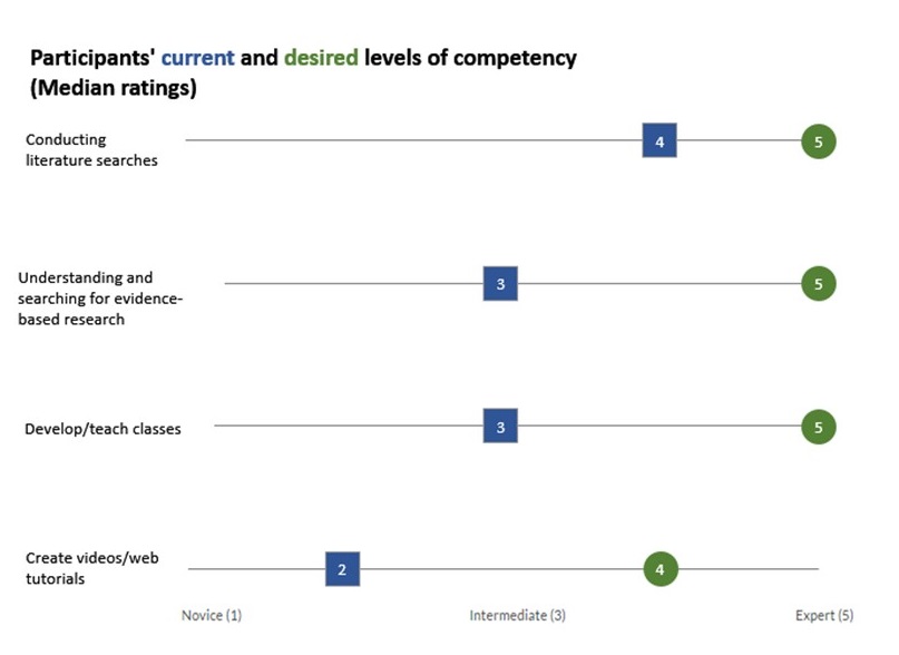
The NEO, in turn, consulted the writings of one of our favorite dataviz oracles, Stephanie Evergreen. And she did not disappoint. We found the ideal solution: dot plots! Evergreen’s easy-to-follow instructions from this blog post allowed us to create dot plots in Excel, using a few creative hacks. This approach allowed us to thematically cluster results from numerous related questions into one chart. We were able to present data for 60 questions in a total of seven charts.
I would like to point out a couple of design choices I made:
- I used different shapes and colors to visually distinguish between “current proficiency” and “desired proficiency.” Navy blue for current proficiency was inspired from NNLM’s logo. I used a complimentary green for the desired proficiency because green means “go.”
- Evergreen prefers to place labels (e.g., “conducting literature searches”) close to the actual dots. That works well if your labels consist of one or two words. We found that our labels had to be longer to make sense. Setting them flush-left made them more readable.
- I suggested plotting medians rather than means because many of the data distributions were skewed. You can use means, but probably should round to whole numbers so you don’t distract from the gaps.
Dot plots are quite versatile. We used the format to highlight gaps in proficiency, but other evaluators have demonstrated that dot plots work well for visualizing change over time and cross-group comparisons.
Dot plots are not as easy to create as the default Excel bar chart, but they are interesting. So give up bars for a while. Try plotting!
 ABOUT nnlmneo
Email author
View all posts by nnlmneo
ABOUT nnlmneo
Email author
View all posts by nnlmneo
 Visit us on Facebook