Using Charts for Analysis: a Blog Post Fail
Posted by nnlmneo on August 14th, 2017
Posted in: Data Analysis, Data Visualization
When I volunteered to write this blog post, it was going to be about how a small increase in your social media presence could result in a large increase in website traffic. Instead, it’s a lesson of how charts can be great tools for analyzing data, and how you should always keep an open mind when approaching a blog post. Click on any of the charts to view them at full size. Enjoy!
The Setup
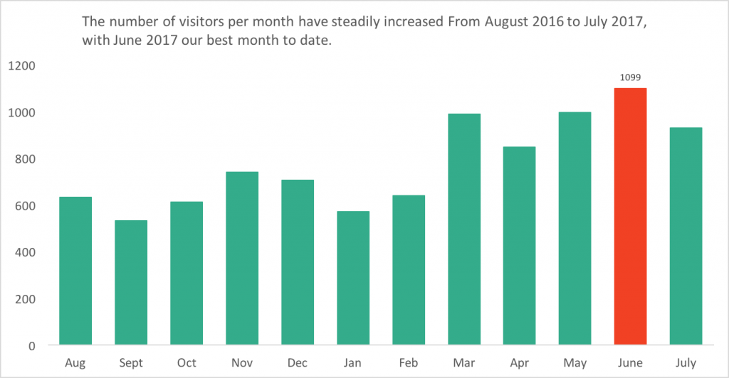
Over the past few months, the NEO has seen an increase in monthly blog visits. We take great pride in our blog posts, and have enjoyed seeing this increase. June was our best month to date yet, with over 1000 views!
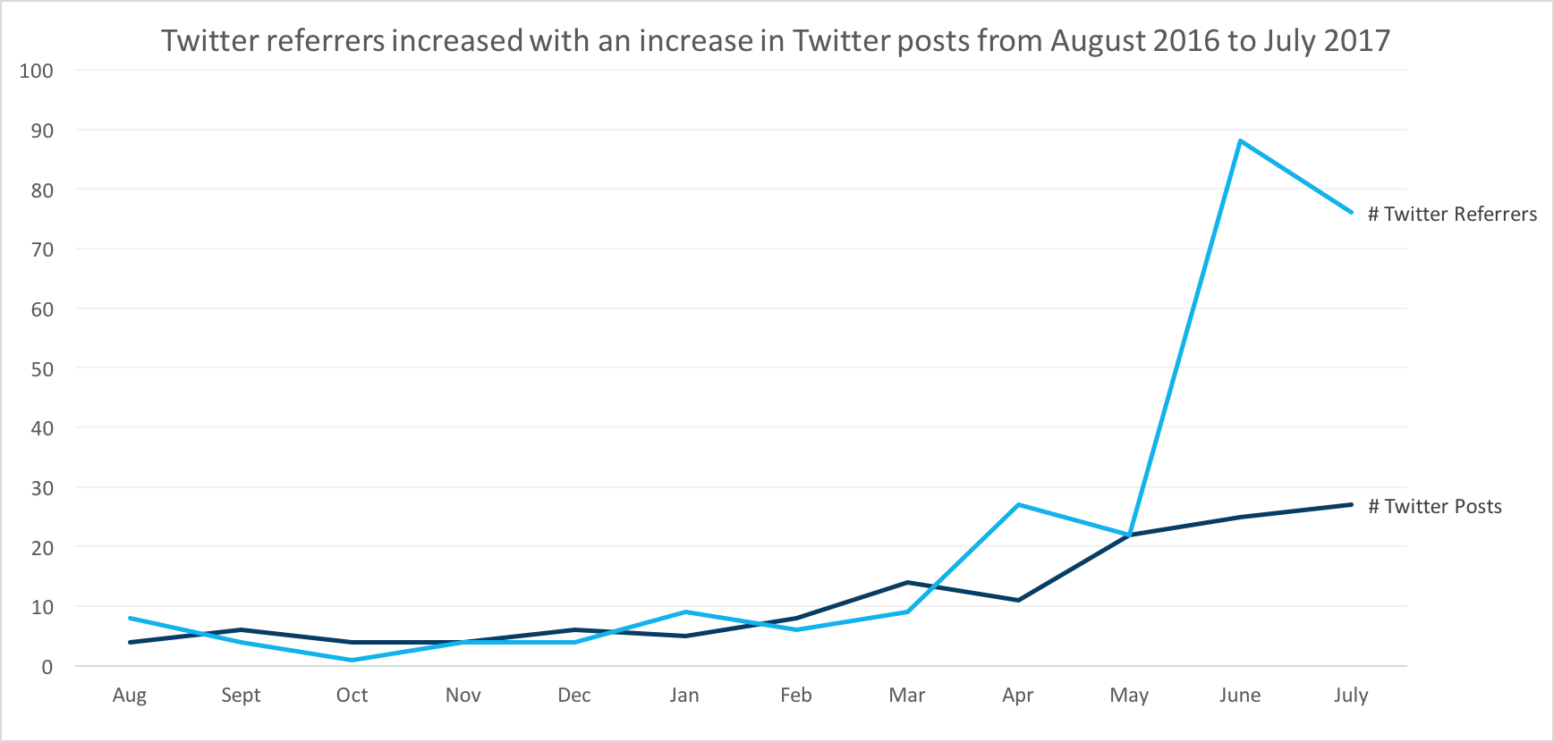
We were also curious – what was the reason for this increase? Was it, perhaps, an increase in our Twitter activity? I decided to investigate. I logged into WordPress and looked at our Referrer statistics. A Referrer is any “other blogs, web sites, and search engines that link to your blog.” A view is counted as a referrer “if a visitor lands on a URL on your site after clicking a link on the referrer’s site” (WordPress). This means that any traffic to our blog coming from a tweet would be listed as one referrer view from Twitter. After looking at a few months’ worth of data, I saw that the number of Twitter referrers has in fact increased over the past few months. I created a line chart comparing the number of tweets per month with the number of Twitter referrers.
The results made me happy – our increase number of tweets did have an impact on the number of Twitter referrers. Our efforts in social media were making a difference! What a great blog post!
Digging deeper into the data
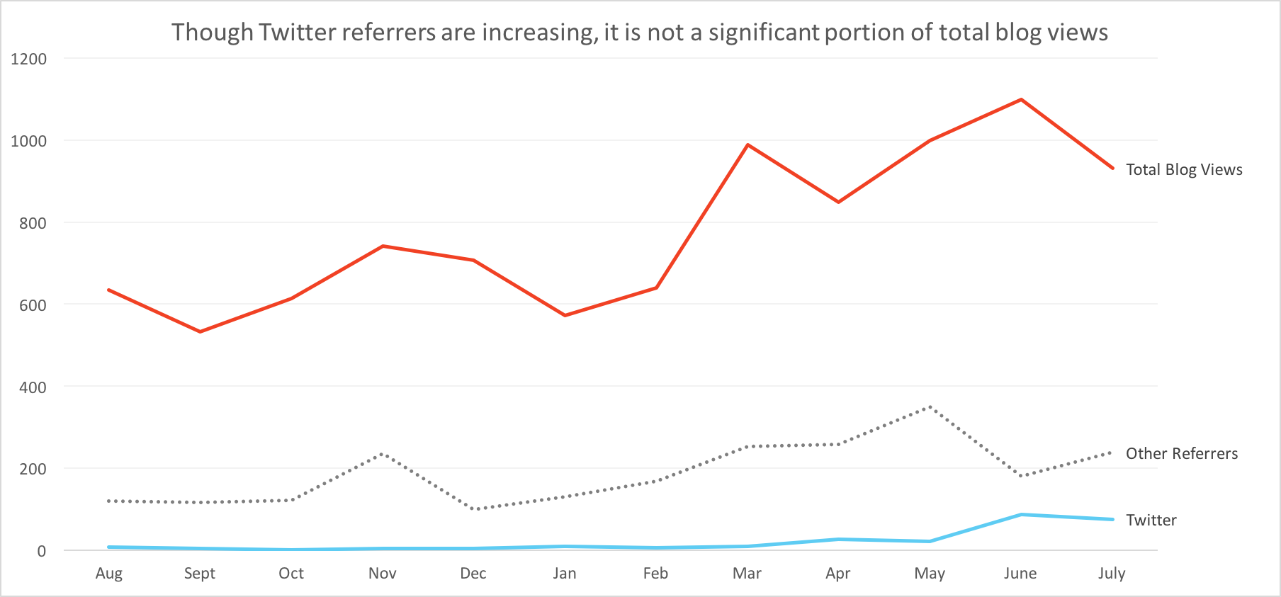
My curiosity got the best of me though. How did Twitter referrals compare to other referrers? WordPress analytics did not allow me to compare monthly referrer stats, so I made a new spreadsheet. Staring at the numbers side-by-side didn’t help either, so to visualize the data better I made a line chart. The results were a bit surprising. It was true that Twitter referrals increased, but in the scheme of the other referrers it wasn’t much.
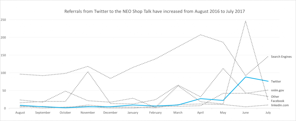
I did notice, however, the large spike in Facebook referrals. That came from the American Evaluation Association (AEA) posting our blog post The Cookie Exercise: Setting Criteria on Facebook. They also shared it on Twitter, which would account for the extra high bump in June for Twitter.
Another realization came to me when talking with Cindy, the Assistant Director of the NEO. As I was showing her the charts I created, she asked me to make one more – one that shows the total Twitter referrals, other referrals, and total blog visits in one chart. The chart looks like this:
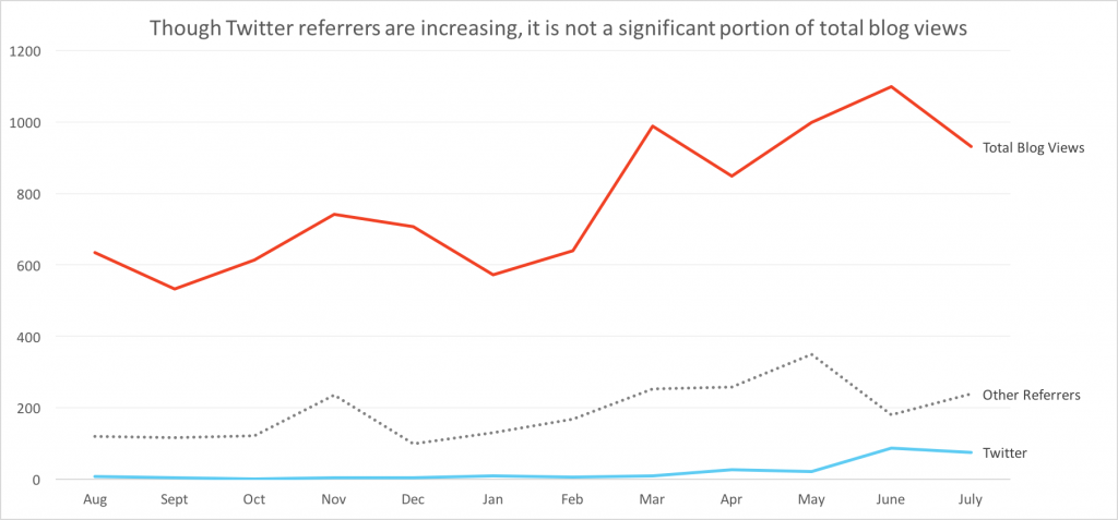
The Twitter referrals do not look so significant in comparison to the total blog views! What would happen to my blog post?
Lessons learned
Though my blog post didn’t come together like I expected, I learned a lot from this exercise. The most important lesson was about charts. I usually think of charts to present my findings, something that is created after I collect and analyze data. Here, I used charts to explore and analyze data, before I reported the data. Charts and graphs can be used to make sense of our data.
My second lesson was in the type of data that I collected. While talking to Cindy, I had to rely on my memory of when our posts were retweeted, or when the AEA shared our blog post. If such information is important to me, and I am not seeing it on native social media analytics, I need to create my own spreadsheets or dashboards.
Finally, my third lesson should be familiar to those who read the NEO Shop Talk on a regular basis (or read my 5 Things I Found Out as an Evaluation Newbie blog post) – you can always learn something from failure. My blog post did not come out the way I wanted, but through the process of writing it I learned a lot about how to analyze data, and where I could improve my evaluation skills. Remember, failure is an option!
 ABOUT nnlmneo
Email author
View all posts by nnlmneo
ABOUT nnlmneo
Email author
View all posts by nnlmneo
 Visit us on Facebook