Jul
20

Posted by Cecilia Vernes on July 20th, 2020
Posted in: Announcements, Blog, How To, PHDL Resources, Public Health
As previewed recently in an earlier article, PolicyMap is included in the list of databases recently added to the PHDL collection. This data-driven mapping tool with a data warehouse of over 50,00 indicators is used by novices and experts alike in policy planning and programming.
If you are working off-site, log in to the PHDL home page using your account. If you are onsite at your public health department office, see your PHDL Intranet page.
Scroll down on the PHDL page and click on ![]()

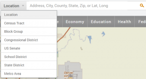
Once connected, search for a geographical area by filling in an address in the Location field or click on the drop-down arrow in the search box, as below, for additional geographic options.
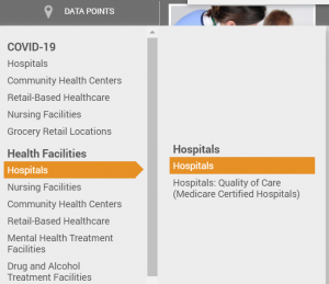
Categories available for the Data Layer are listed below.
![]()

The same categories apply for adding Data Points to your map. Click on that category and look to the right side of the drop-down menu, roll over ‘Hospitals’ , and then ‘Hospitals’ again to the right.
Your map will display the data visually with a legend, including the ranges for the data and color selected. These are both adjustable.
To learn more about customizing your maps go to the maps tutorial page

Use the icons at the right on your page to print, download, share or save your map in your workspace.
More tutorials and a FAQ are available at the support page.
Two instruction sessions are scheduled for early August with the team from PolicyMap. Consult the online course listing for details and to register.